Visual Component Testing Review Workflow
The Screener visual testing solution is going to be discontinued on May 31st, 2024. You can migrate to the new Sauce Labs Visual Testing solution by following the integration steps.
If you have any questions, please reach out to your Customer Success Manager or Sauce Labs Support.
Main Review Workflow
Learn the Screener workflow for reviewing UIs. Each UI state under test has one of the following statuses:
| UI State | Description |
|---|---|
| New | Has not been reviewed yet. |
| Changed | Has changed visually when compared to its accepted baseline. |
| Accepted | Is visually the same as its baseline OR has been reviewed and accepted by a team member. |
| Rejected | Has been reviewed, found to have defects, and rejected by a team member. |
1. Start Reviewing.
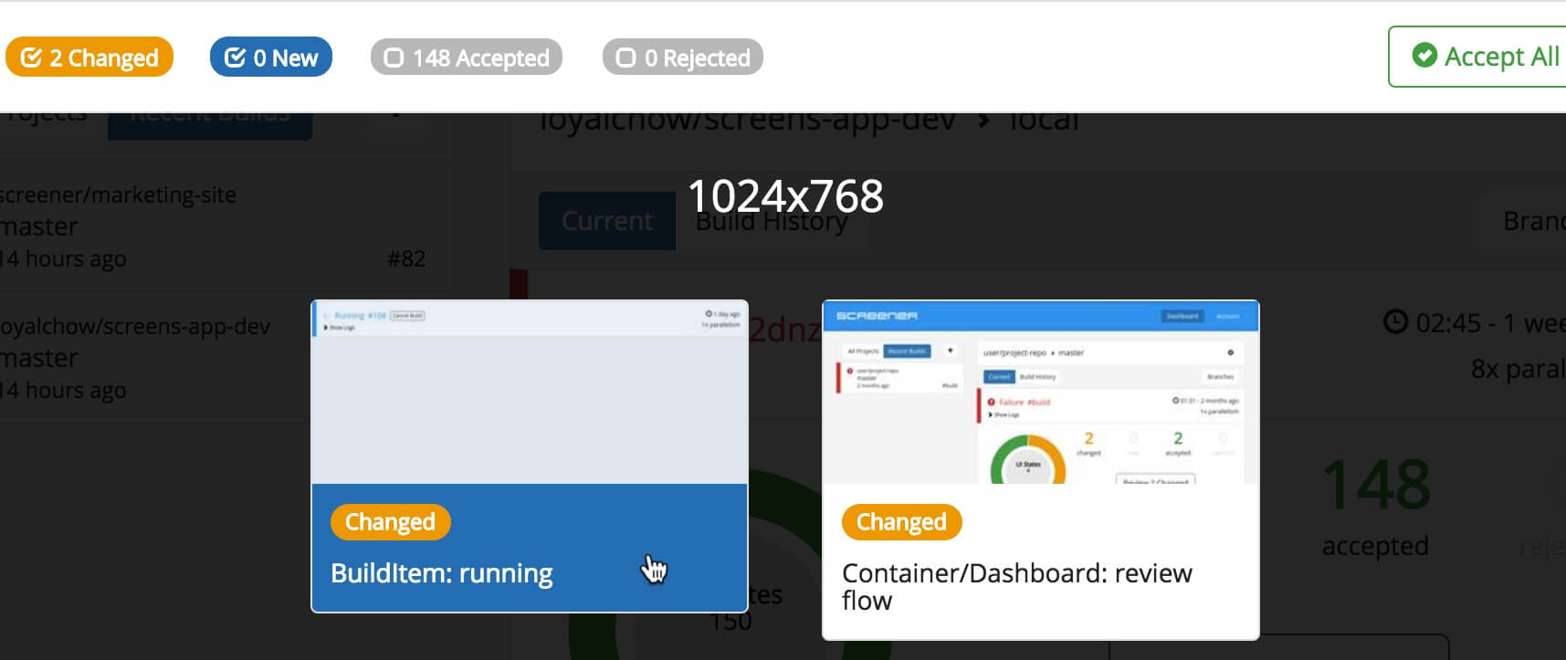
When a test has a New or Changed UI state, it will show a Review button:

Clicking Review will display a list of your UI states filtered to only those needing review.
To start reviewing, click on the first UI state:

2. Review UI State.
You'll then be presented with screenshots of the selected UI state:

If a baseline exists, a side-by-side view will be displayed with the baseline screenshot on the left-hand side and the current screenshot from the latest build on the right-hand side.
Changed UI states will include highlights of visual changes directly overlayed on the screenshots.
3. Accept or Reject
After reviewing the UI state, you can either:
- Accept: if the screenshots are as expected, which will set the current as the new baseline (keyboard shortcut = Shift + Up Arrow); or
- Reject: if defects are found which need to be fixed (keyboard shortcut = Shift + Down Arrow).
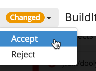
To Accept or Reject, you can use the aforementioned keyboard shortcuts or select from the status dropdown:

4. Continue Reviewing
Continue reviewing the remaining UI states. You can navigate by clicking on the next/previous arrows (pictured below) or by using keyboard shortcuts (next = Right Arrow; previous = Left Arrow):

Use the Accept All button to quickly set all filtered UI states to accepted.
5. Review Complete
When all UI states have been reviewed, the filtered state list will be empty:

The build status will be updated to Success when all UI states have been accepted.
The build status will be updated to Failure when there are rejected UI states.
Testing Against Multiple Devices and Resolutions
Screener provides the ability to test responsive designs across various devices and resolutions.
To test against multiple resolutions and/or devices, add the resolutions option to your screener.config.js file, with an array of resolution items.
Each resolution item in the array is either:
- A string in the format:
<width>x<height>.- Example:
'1024x768' - An object with
deviceNameand optionaldeviceOrientationproperties.- Example:
{ deviceName: 'iPhone 6' }Supported
deviceNamevalue options (click here to expand):- iPad
- iPad Pro
- iPhone 4
- iPhone 5
- iPhone 6
- iPhone 6 Plus
- iPhone 7
- iPhone 7 Plus
- iPhone 8
- iPhone 8 Plus
- iPhone X
- Galaxy S6
- Galaxy S7
- Galaxy S8
- Nexus 4
- Nexus 5
- Nexus 5X
- Nexus 6P
- Nexus 7
- Nexus 10
Example config using resolutions:
module.exports = {
  ...

  resolutions: [
    '1024x768',
    {
      deviceName: 'iPhone 6'
    },
    {
      deviceName: 'iPhone 6 Plus',
      deviceOrientation: 'landscape'
    }
  ]
};