Flame Graphs
Flame graphs are a powerful visualization of a large collection of stack traces. Until flame graphs, sampling profilers offered only the ability to merge exactly identical stack trace sequences. For complex applications with divergent stack sequences, there may be tens of thousands of unique stack trace sequences. Unfortunately, this makes it difficult to identify common bottlenecks (sub-sequences) across the samples. Flame graphs merge common sub-sequences of many stack trace sequences, improving the ability of a practitioner to understand bottlenecks.
Flame graphs are applicable to lots of other applications involving large collections of stack traces. One such application is visualizing instability if a centralized corpus of stack traces are available to you, as provided by Backtrace.
Below is an example flame graph of real instability data of our object store from development, experimental and production release channels.
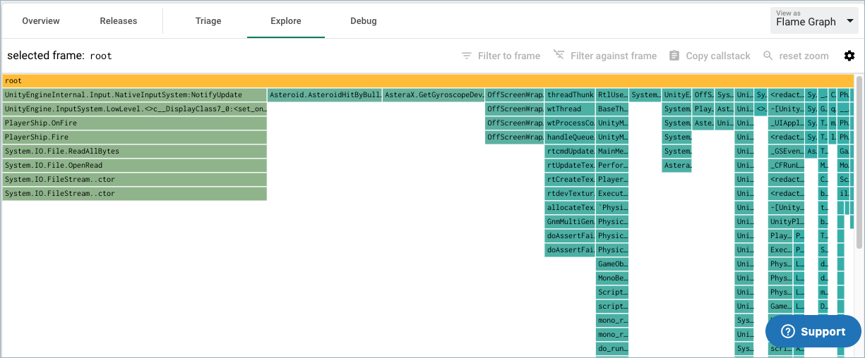
Introduction
This section provides a brief summary of the flame graph. If you are already familiar with flame graphs, you may skip this section. A deeper introduction to flame graphs is available at ACM Queue, written by Brendan Gregg. We will demonstrate the flame graph by example.
Below is a flame graph for one stack trace a -> b -> c -> d, where a is the outer-most function. In other words, a calls into b calls into c calls into d.

From top to bottom, every rectangle represents a frame in the stack trace with the inner-most frame at the top and the outer-most frame second to bottom. The bottom-most rectangle is a common root for all stack traces. The colors of the rectangle do not encode anything useful in this variation of a flame graph and serve to make the graph easier to read.
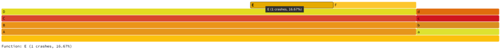
Let us introduce two more stack traces into the visualization now, a -> b -> c -> d and A -> B -> C -> D. Below is the result.

The X-axis is now divided by both stack traces. As there is one stack trace sample of a -> b -> c -> d and one stack trace sample of A -> B -> C -> D, the X-axis is evenly divided across the two sequences. Let us introduce two more samples of A -> B -> C -> D such that there are a total of three samples of A -> B -> C -> D and one sample with a -> b -> c -> d. The result is below:

Note, in the interactive version of the visualization, mousing over a rectangle tells you the sample count. In this case, 3 samples with that stack sequence involved a function call into A. Let us now introduce two more stack traces into the visualization, A -> B -> C -> D -> E and A -> B -> C -> D -> F.
The height of the visualization is bound to the deepest callstack in the data set and the width is bound to the number of unique sequences. This scales well even for many tens of thousands of fingerprints.